Get the GuestTappy app
Scan the QR code to download the app
 Big hotel chains have the largest marketing budgets, so their websites must always be the ones that attract the most attention. Right? Wrong. In the USA recently, it’s the websites of smaller, boutique hotels – and even B&Bs – that have been generating the most buzz in the media. Why? Because these smaller hotels are much better (and quicker) at adapting to what customers want when booking accommodation online. And these days…
It’s All About Images!
A strong visually-oriented layout is the only way to go, because (and this can’t be emphasised often enough)…Photos sell rooms.
1. Good photos.
2. Big photos.
And, most importantly…
3. Prominent photos
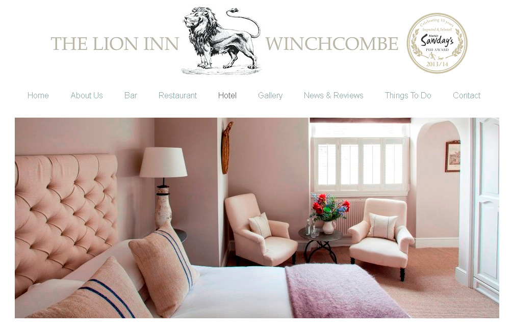
Here’s a great example of a rooms page (courtesy of the Lion Inn, Winchcombe)…

Don’t force your customers to hunt around for images that will tell them what the place they’re thinking of staying at actually looks like. Put them front and centre. You own a great property – let the world know about it!
So, even if you don’t want to redesign your whole site, at the very least get your web designer to boost the size and number of quality visuals on the front page and all the room pages. And, ideally, add a big, unmissable link on the front page itself that shouts, “ROOM IMAGES.”
Scan the QR code to download the app